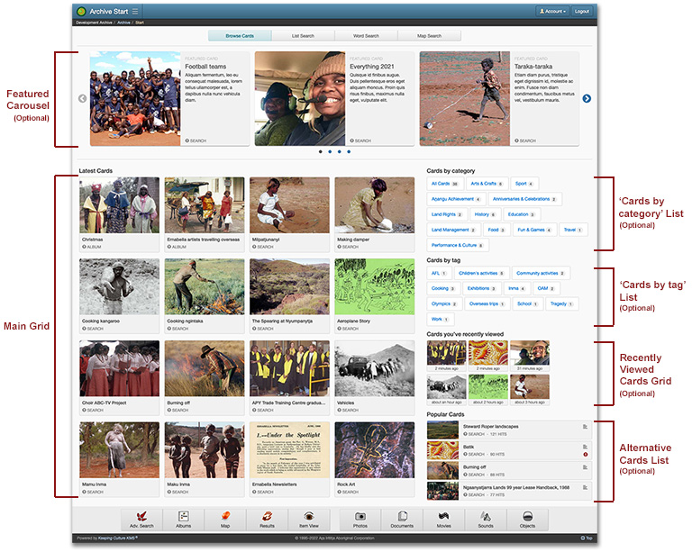
The Archive Start page is first presented to the user when logging into the archive. The page displays five possible layouts – Cards, Selection lists, Basic search, Spatial search, and Albums – each providing a different method of searching or retrieving records from the archive.
However, not all layouts may be relevant or suitable for your archive. For example, the Spatial search layout is dependent on the availability of spatial metadata in Place records and media. Equally, the Cards and Albums layouts require the existence of Cards and Albums being available in the system.
You should consider the suitability of each layout in relation to the contents of the archive, and if a layout is not required, then it can be hidden by disabling it.
Changes as of July 2022
The ability to hide the Albums layout on Archive Start page was previously an option inside the archive’s Preferences page. The behaviour has now moved to the ‘Display options’ control on the ‘Layouts’ tab of the customisation Archive Start page. See Layouts and button labels section.

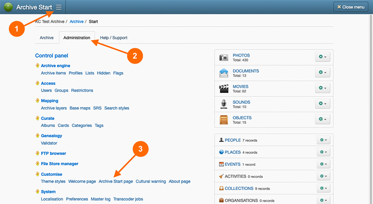
To customise the Archive Start page, navigate to:
- Main Menu
- Administration tab
- Archive Start page hyperlink under the ‘Customisation’ heading.
Layouts and button labels
In the ‘Layouts’ tab on the customisation Archive Start page, you can configure the following properties for each of the five layouts:
- Visibility: enable or disable the visibility of each layout. When disabled, the layout will not be presented on the Archive Start page.
- Order: set the display order of each layout.
- Default layout: select the default layout that is presented to the user when first logging into the archive.
- Button labels: provide button labels for each layout in the languages supported by the archive.
The Archive Start page must have at least one layout enabled, and the default layout must be a visible layout.
Card settings
The Browse Cards layout has two sub-layouts:
- Home: displays ‘featured’ Cards in a carousel; organises latest or recent added Cards in a grid; recently viewed Cards by the user in a grid; popular Cards in a list; and provides navigation to Card categories and tags.
- Groups: displays Card for specific categories and tags in a grid format.
The ‘Cards’ tab on the customisation Archive Start page contains the following options that affect the appearance of the Home layout:
- Featured carousel: enable or disable the visibility of the featured Card carousel; select the number of Cards and the retrieval order for the Cards displayed in the carousel.
- Main grid: set the selection criteria for the Cards to display in the main grid – either ‘Most recent’ or ‘Most popular’ Cards; set the number of Cards to display; and whether Featured Cards should be excluded from appearing in the main grid.
- Categories and tags: set the visibility of the ‘Cards by category’ and ‘Cards by tag’ navigation lists.
- Recently viewed Cards: set the visibility for the ‘Cards you’ve recently viewed’ grid; and select the number of Cards to display in the grid.
- Alternative Card list: enable or disable the visibility of the alternative list; set the number of Cards to display in the list; and whether Featured Cards should be excluded from appearing in the alternative list.
The Alternative Card list displays the alternative selection criteria to the main grid. For example, if the main grid displays ‘Most recent’ Cards, the alternative Card list will display the ‘Most popular’ Cards.

Basic search settings
The ‘Basic search’ tab on the customisation Archive Start page contains the following settings that alter the appearance and options available on the Basic search layout:
- Search class limit: enable or disable the inclusion of searchable Knowledge class checkboxes in the search limit control; and whether the search limit control should have a more prominent expanded appearance.
- Keyword search: allow or deny ‘Return’ and ‘Enter’ keystroke in the Keyword text field from commencing the search process.
- Date search: choose the visibility options for Date search control.
- Archive number range search: choose the visibility option for the archive number range search control.
- Find references: choose the visibility option for the references search control.
Search class limit control layouts
The following screenshots show the different appearances of the compact and expanded display options.
Compact


Expanded


Control visibility options
There are three visibility options (display modes) for controls:
- Hidden: the control is never shown.
- Always shown: the control is always shown.
- Optional: the control is not shown by default but can be optionally made visible by the user. The control is also shown when a value has been previously provided for the control.
Selection list settings
The ‘Selection list’ tab on the customisation Archive Start page contains the following settings to customise Selection Lists behaviour in the following ways:
- You can set the order of appearance in the list control. Ideally you would prioritise the list entries from top to bottom, positioning the most used Knowledge classes towards the top.
- For People records, and other classes identifiable in features, you can apply a default checkbox selection for the ‘limit to’ option displayed at the bottom of these lists.
